What distinguishes a website that converts from one that just looks good? It’s often the little things that make a big difference. A button that’s two pixels too small. A link that doesn’t look like a link. A form field that nobody needs. These details can determine whether someone takes the bait – or bounces off in frustration.
Using methods such as heatmaps and session recordings, I regularly carry out usability analyses to investigate user behaviour across various platforms. In doing so, I repeatedly observe the same patterns: users click on the same element several times, overlook important CTAs, and abandon forms halfway through.
The problem is that such obstacles to the user journey are usually not even visible in traditional meetings and reporting sessions. It’s only when real people use your website that you can see where friction arises. I’ll show you seven typical usability mistakes that I see time and again in my analyses – and how you can avoid them.
#01 Touch targets are too small or too close together
The Problem
In the mobile app, users have to tap several times because the interactive elements are too small or too close together.
Touch Targets vs. Poor Usability: An Example
Someone wants to open the login on your website. The login icon – small and delicate – sits in between two other icons. First, the user accidentally taps the search. Second: the card. Third attempt: at last! He or she can select the login. Frustration mounts.

This problem can be quantified: websites with optimised touch target sizes have a 15 per cent higher mobile conversion rate (Webability, 2026). Touch targets that are too small or too close together lead to ‘rage taps’ – frustrated, repeated tapping on the same element.
What to Look For:
- Set the size of touch targets on mobile devices to at least 44×44 pixels
- Ensure there is sufficient space between clickable elements (at least 8 pixels)
- Particularly important: navigation, CTAs, form buttons and icons in the header and footer
- Test on real devices – not just in a browser simulator
#02 Overlays cannot be closed by clicking outside of them
The Problem
Users instinctively try to close overlays by clicking outside them … and fail to do so.
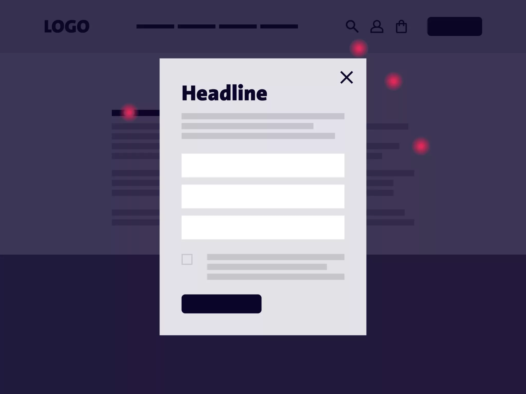
This is one of the most common UX mistakes. Whether it’s a newsletter pop-up, a cookie banner or an expanded navigation menu: almost all users instinctively tap or click outside the overlay to close it. Not on the X. Not on a collapse arrow. But simply: next to it.
If this interaction doesn’t work, it causes frustration. Users have to actively search for the close button, tap repeatedly at nothing, and lose their flow. This is particularly frustrating with navigation overlays featuring sub-menus: the feeling of being ‘trapped’ is detrimental to the user experience.
What to Look For:
- It should be possible to close all types of overlays by clicking or tapping outside them
- Additionally: visible X icon (click area at least 44×44 pixels)
- Particularly important for navigation systems with sub-menu levels
- Test behaviour on both desktop and mobile devices
#03 Forms Ask Too Many Questions—or the Wrong Ones
The Problem
Every unnecessary form field measurably reduces the conversion rate.
A contact form with twelve mandatory fields. A newsletter sign-up form that asks for an address and a telephone number. A checkout process that requests information whose relevance is unclear. This is where users abandon the process.
The figures are clear: if you reduce a form from four to three fields, the conversion rate increases by almost 50 per cent (Opollo, 2025). Every additional field increases the cognitive load – and thus the likelihood that users will abandon the form. The rule of thumb for forms in UX is: as many fields as necessary, as few as possible. It must be possible to understand the purpose of each question. If the relevance is not apparent, trust declines.
The Special Case: B2B Forms
Studies show that the optimal number of fields for B2B contact forms is 3–5 (Forrester Research, 2024). It may therefore make strategic sense to include one or two additional qualifying fields (e.g. industry, current system). These signal to potential customers that you are preparing specifically for them, which builds trust by suggesting that you provide high-quality advice.
What to Look For:
- Keep form fields to an absolute minimum and only ask for information whose relevance is clear to the user
- Only display fields once they become relevant as a result of a previous selection (e.g. I select ‘Company’ – fields for company details then appear)
- In a B2B context: 1–2 qualifying questions can build trust – provided they convey added value
- Carrying out A/B tests: How do 3 fields compare with 5 fields in terms of performance with your target audience?
#04 People often just skim through texts
The Problem
Imagine it exists: the perfectly crafted product description. Every selling point is spot on, every piece of content is just right, every detail is on point. But your target audience doesn’t even read it – because they’ve already scrolled past after the first three words.
This is because website visitors rarely read word for word. They skim. Users scan digital content in an F-shaped pattern. They read the first few words of a line, skim over the next few, and jump to the next heading. Blocks of text that are too long are skipped entirely. Important information that only appears in the third sentence is lost.
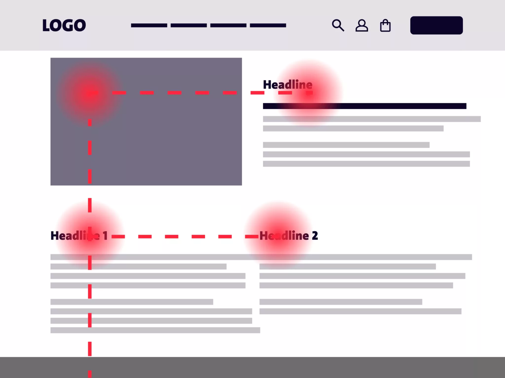
This means that the most important information must appear within the first 2–3 words of a paragraph. Not at the end, not hidden in subordinate clauses. It must be immediately recognisable. What’s more, if all paragraphs are the same length and there are no subheadings to break up the text, there are no visual anchor points – and users will simply scroll on.
What to Look For:
- Put the most important points at the beginning of paragraphs
- Formulate headings that are clear, descriptive and meaningful
- Creating a visual hierarchy: using size, weight and colour to establish priorities
- Break up long blocks of text using subheadings, lists and highlighting
#05 Too many visual cues can be overwhelming to the eye
The Problem
If everything is important, nothing is important. A lack of visual hierarchy often leads to ‘cognitive overload’.
Visual Cues vs. Poor UX: Examples
A page where three main CTAs in bright colours are vying for attention. Next to them is a banner; further down, four equally designed offer tiles; interspersed amongst them are rows of icons, pop-ups and animated elements. Where should you look? What’s the next logical step? The problem: a lack of visual hierarchy. When all elements are clamouring equally loudly for attention, users can experience ‘cognitive overload’ – the eye feels overwhelmed, disoriented and stressed. This leads to longer processing times, more errors and higher abandonment rates.
What to Look For:
- Establish a clear hierarchy: one primary CTA per page/section, with secondary CTAs given less visual prominence
- Using whitespace deliberately – space between elements creates clarity
- Limit interaction options: For filters, navigation and product selection, a maximum of 5–7 options at any one time (more options reduce conversion rates because users feel overwhelmed)
- Less is more: any element that doesn’t serve a clear purpose can be removed
#06 Clickable elements are not recognizable as such
The Problem
Users click on elements that aren’t clickable – and miss the ones that are meant to drive conversions.
A headline with an underline that looks like a link but isn’t one. A simple line of text that could actually be clicked, without any visual cue. An icon that looks like a button but doesn’t trigger any action. It’s frustrating, time-consuming – and costs conversions.
A lack of, or inconsistency in, visual cues indicating clickability are essential – yet easily avoidable – usability errors. Over the years, users have learnt which visual signals indicate interactivity: underlining, hover effects, button-like design, arrows and micro-animations. If these best practices are ignored or misapplied, navigation suffers. This leads to measurable frustration: dead clicks (clicks on non-interactive elements) and overlooked CTAs are two of the most common UX errors in session recordings.
What to Look For:
- Buttons must have a distinctive shape, background colour and sufficient contrast; text links must be underlined (and may also be in a contrasting colour)
- All clickable desktop elements feature hover effects
- Arrows, underlines and button shapes should ideally only be used for clickable, interactive elements, and not purely for decorative purposes
- Check contrast: Are all interactive elements clearly distinguishable for users with disabilities?
#07 Lack of Direction
The Problem
Breadcrumbs, active navigation points, visible page structure: if these anchors are missing, users quickly lose their bearings.

Not every user arrives via your homepage. Many land directly on a subpage via Google, social media or ChatGPT citations. In such cases, the first question is usually: Where am I? Which company is this? How do I get back to the overview?
If there are no clear points of reference, uncertainty arises. Users leave the site more quickly because they feel ‘lost’ or because they are unsure how to find the content they are looking for. Complex navigation without visual cues indicating their current location leads to frustration. A classic usability mistake that is easy to avoid.
What to Look For:
- Implementing breadcrumb navigation – particularly for pages with more than two hierarchical levels
- Clearly highlight the active navigation item: using colour, underlining or a visual marker
- Logo/company name visible and clickable in the header (links to the home page)
- Visual indicators in submenus: Users must be able to tell which level they are on
Conclusion: Small steps, big impact
Usability errors that have a significant impact are rarely spectacular. The UX design examples in this article show that they are often small and inconspicuous – and that is precisely why they are so critical. A touch target that’s too small here, a missing hover indicator there, one too many form fields: taken individually, they seem harmless. Taken together, however, they determine whether potential customers convert or leave the site in frustration.
The good news is that these errors can be systematically identified and rectified. With the right tools – heatmaps, session recordings, usability tests – you can see where users are really struggling (read more about this in ourarticle on usability analysis). And with targeted optimisations, you can measurably increase conversion rates without having to completely overhaul the design.

Data-driven usability analyses aren’t just a luxury for large corporations. They’re the foundation of any website that takes its users seriously. Understanding how users behave allows you to make better decisions that result in less frustration and more conversions, trust, and credibility on your website.
Helena Stangl, UX Expert
Would you like to know how visitors really experience your website?
Let’s work together to identify where untapped potential lies – based on data, prioritised and actionable.