Contact us
wellsystem

well well well done

Corporate Identity | UI Design
What you will learn in this case: How strategic brand development led to a brand identity that clearly positions wellsystem as a standalone smart wellness brand—with a focus on B2B and a design that perfectly captures technology, regeneration, and premium quality.
Moodboard mit Farbmustern, Schriftauszug der Mona Sans und Eindrücke der Bildwelt für die Neuausrichtung der Corporate Identity von Wellsystem.
The challenge

Feel good. Lead the way.

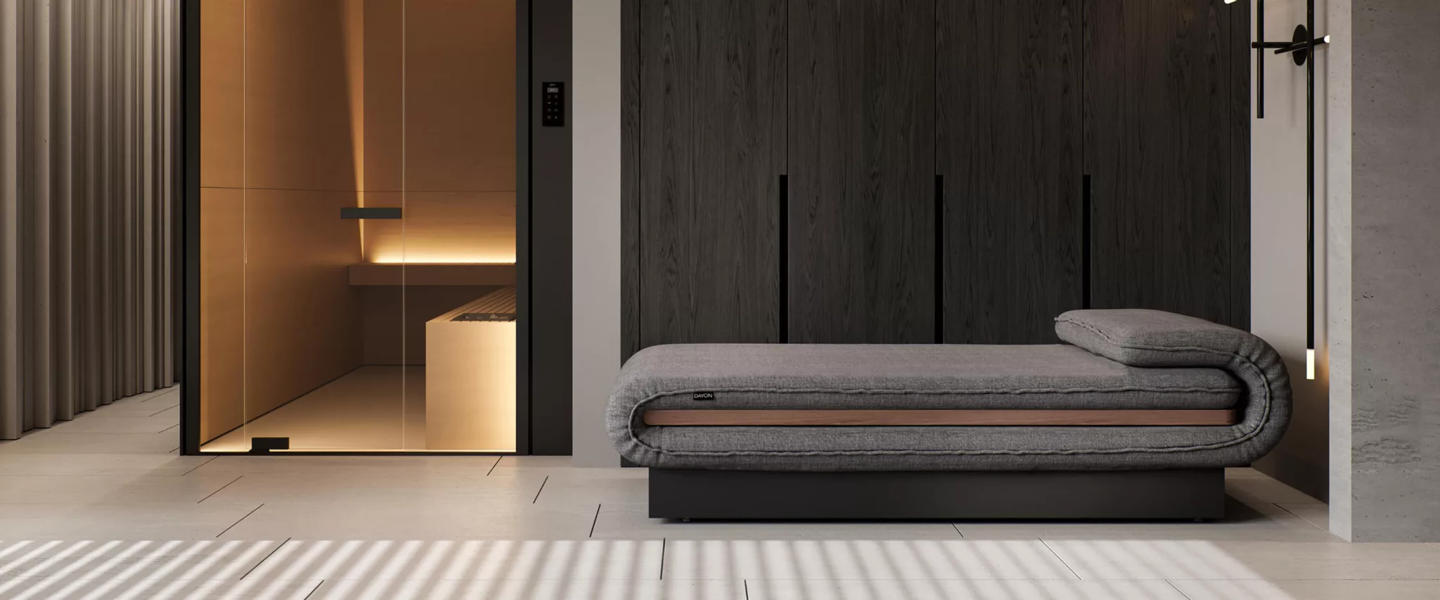
As a pioneer in hydrojet technology and a leader in the smart wellness market, wellsystem stands for the highest quality, deep-tissue massage treatments, and regenerative light therapy. Within the JK Group’s portfolio, the young brand had to deliberately position itself alongside the established Ergoline product brand—while simultaneously building its own distinct brand identity.

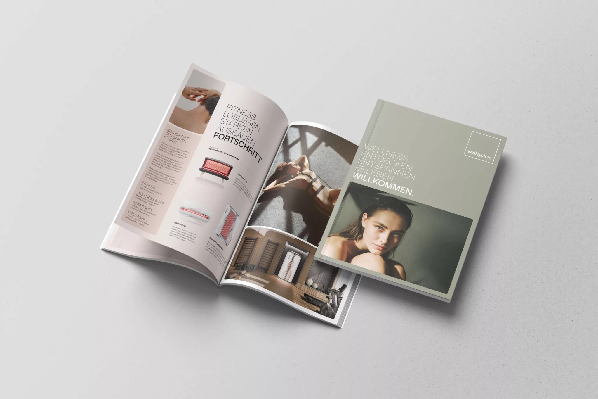
At the same time, wellsystem addresses very diverse target groups. The focus was on B2B customers in the hospitality, wellness, fitness, and health sectors who are looking for equipment and solutions that can be meaningfully integrated into their businesses.

Approach

Clarification. Clarity.

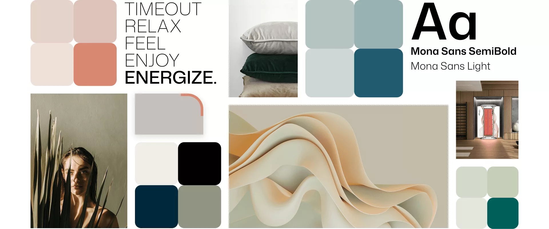
In the first step, we analyzed the market, target audiences, and brand architecture, and refined the strategic foundation through stakeholder interviews and discussions with management. The Golden Circle of the JK Group umbrella brand served as a framework for developing a distinct brand logic for wellsystem: smart wellness solutions that are not only technologically impressive but also integrate flexibly, reliably, and cost-effectively into existing business models. This gave rise to the positioning, brand claim, and visual concept.

Positioning

Word & Meaning

Home of Smart Wellness embodies this very vision: technologically sophisticated, built on partnership, and designed to work for both B2B clients and their target audiences. The new corporate design translates this positioning into a visual language that combines warmth with precision. A natural color palette creates a welcoming atmosphere, while the layout and information hierarchy ensure clarity, ease of navigation, and a professional appearance.

Ein aufgeschlagenes Magazin von wellsystem neben einem geschlossenen Exemplar mit einem Frauenporträt und der Headline "Wellness. Entdecken. Entspannen. Erleben. Willkommen."
Success – Video content
Success

Discover. Experience.

wellsystems’new brand identity reinforces the brand’s distinctiveness. The website serves not only as a digital showroom but also as a strategic branding tool that brings the brand’s positioning to life and clearly communicates its value proposition to different target audiences.

The brand identity consistently integrates strategy and design. It has a distinctive profile, a high-quality aesthetic, and the resilience required for an international, B2B-driven market environment.

The new website finally gives our brand the presence it deserves—high-quality, inviting, and perfectly aligned with our vision.

Karsten Matuschka, Executive Director of Marketing at the JK Group | wellsystem

Minimalistisches Zimmer mit einem Hydromassage-Bett von wellsystem vor einer dunklen holzgetäfelten Wand und einer Glastür, die zu einer modernen, warm beleuchteten Sauna führt.